Graphic design tips + structure to make your capability statement work harder
What is a Capability Statement — and Why Graphic Design Matters
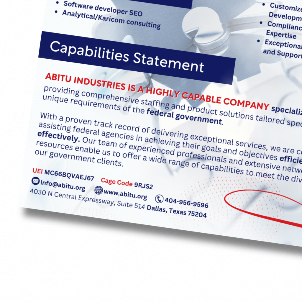
A capability statement is your one-pager (or two-pager) that summarizes who you are, what you do, and why someone should work with you. It is both a marketing piece and a trust builder. Graphic design isn’t the only skill applied when developing a capabiltiies statement. Considering content and sourcing a technical writer to organize your data is essential.
Getting the graphic design right isn’t an optional extra — it’s essential. A clean, well-designed statement:
- Introduces credibility instantly
- Helps scannability so decision-makers find what they need quickly
- Aligns with your branding (logo, colors, fonts) to reinforce identity
- Makes technical or detailed info more digestible via visuals
Core Elements of a Strong Capability Statement Graphic Design
Here are must-haves and best practices for design + content alignment.
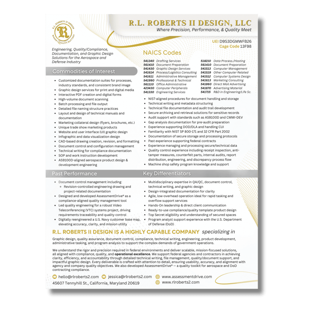
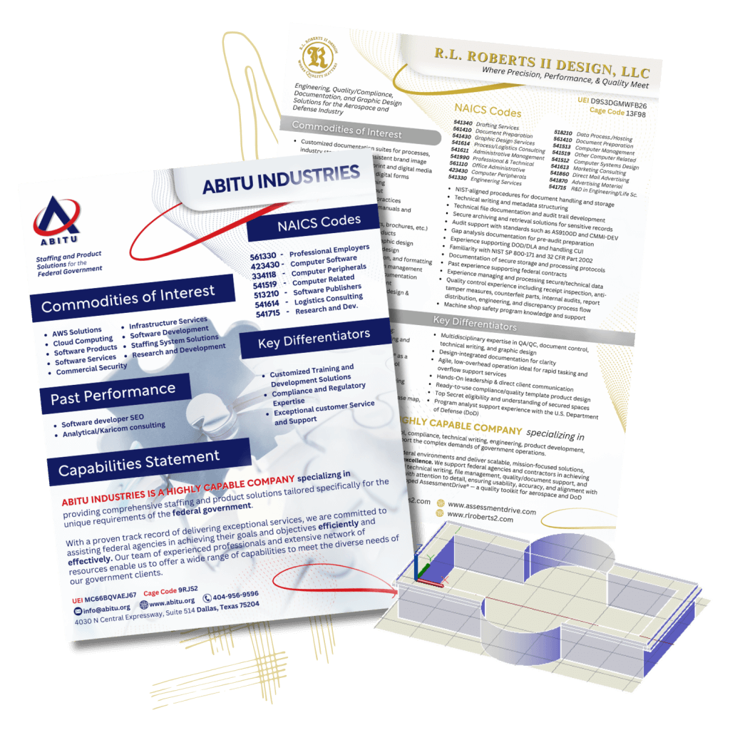
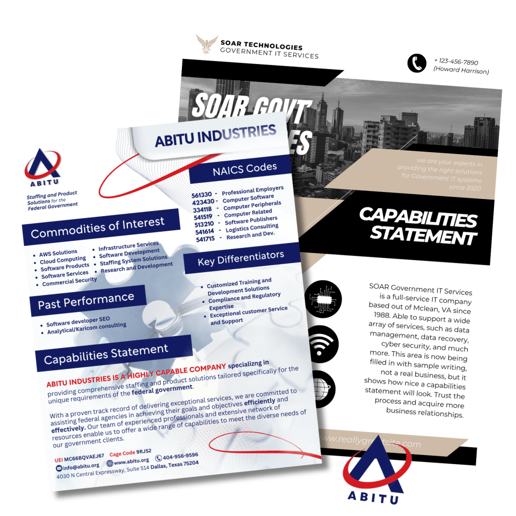
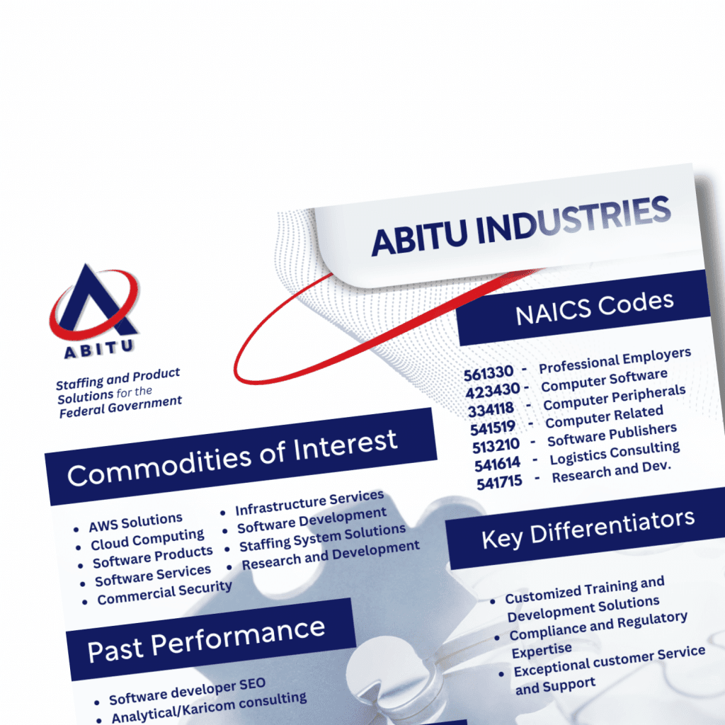
| Element | What to Include | Design Best Practices |
|---|---|---|
| Header / Branding | Company name, logo, tagline, contact info | Make the logo prominent. Use your brand’s color palette. Consistent fonts. Avoid low-res or stretched images. Provide a short mission or tagline. |
| Headline / Summary | One to two sentences that summarize your value proposition | Put this near top; make it bold or visually distinct (larger font or colored background) so it grabs attention. |
| Core Competencies | What you do best — your unique offerings | Use bullet points or icons. If possible, set them in a layout that contrasts background so they pop. Avoid long paragraphs. |
| Differentiators / What Sets You Apart | Your unique strengths: awards, certifications, special tools, niche expertise, etc. | Use visual cues (e.g. badges, icons, infographic elements). Highlight in another color or section so it draws the eye. |
| Past Performance / Key Projects / Case Studies | Examples of work, ideally tied to the target reader’s needs | Use logos, small project snapshots, photos. Layout in a grid or timeline. Visual storytelling helps. |
| Company Data | Basic info: address, years in business, size, NAICS/ACN/ABN or equivalent, certifications etc. | Keep this structured. One area or box. Clean typography. Don’t overcrowd. |
| Call to Action & Contact Info | Who to contact, next steps, website, phone, email | Make sure this is easy to spot. Perhaps a colored footer or sidebar. |
Design Tips & Visual Best Practices
To ensure your capability statement doesn’t get lost in a pile, follow these graphic design best practices:
- Keep layout clean and uncluttered
Ample white space helps your eyes rest and makes the document look professional. Avoid cramped text. - Use hierarchy in typography
Headings, subheadings, body text. Different font sizes and weights. Bold what matters. Use color sparingly for emphasis. - Align visuals with content
Use icons, images, charts only when they support meaning. Replace words with symbols where possible (e.g. “Certifications” icon). Ensure image quality is high. Avoid generic stock photos that dilute trust. - Brand consistency
Colors, fonts, imagery style should match your website, business cards, and other assets. Consistency builds recognition. - Readable formats
Use a layout that works well both printed and digital. Save as PDF. Ensure text is legible on screen and in print. If sending electronically, ensure file size is reasonable. - Tailor for your audience
If you’re sending to government agencies, include relevant codes, compliance info etc. If to a corporate client, focus on outcomes they’ve expressed interest in. Adjust tone, visuals, even terminology to suit. - Use color and contrast strategically
Strategic use of color draws attention and segments sections. But avoid overuse or “loud” colors that distract. Contrast helps with readability. - Visual anchor / focal point
Have something that draws attention: company logo, a strong summary, signature project image. A visual hook at the top or one side helps pull reader into the document.
Structure & Flow: Example Layout
Here’s a suggested structure (one-pager) that balances design and content.
- Top band / Header: Logo + Capability Statement title + tagline + contact info
- Left or Right Sidebar (colored or shaded): Quick stats, certifications, differentiators
- Main body area:
• Summary / Mission Statement
• Core Competencies (bulleted + icons)
• Past Performance / Key Projects (logos, mini case studies) - Footer: Additional company data (years in business, size, geographic reach) + Call-to-Action + full contact details
If you go to two pages (front/back), use the back for more case studies, project photos, or detailed technical competencies. But front page must make the strongest impression.
Common Mistakes to Avoid
- Overstuffing with text — long paragraphs are off-putting.
- Inconsistent branding — different fonts, color schemes, graphics styles cause confusion.
- Poor image quality — blurry or low-resolution pictures undermine professionalism.
- Generic templates without customization — they look like everyone else’s.
- Ignoring audience needs — using internal jargon or not highlighting what the reader cares about.
- Huge file sizes / bad format for distribution — big PDFs or poor formatting can clog email or be hard to open.
Sample Before & After (Design Rework)
Before: Plain Word document, black text, no color or images, huge blocks of text.
After: Logo + color header; summary “hook”; core competencies with icons; testimonials/project snapshots; clean footer with contact and certs.
You can mock this up easily in tools like Canva, Adobe InDesign, or even PowerPoint if needed. Just stick to the design rules above.
Final Checklist Before You Publish
- Does the statement visually reflect your brand?
- Are the most important facts easy to find at a glance?
- Is everything accurate and up-to-date (projects, certifications, contact info)?
- Is the file format appropriate (PDF, optimized for print & screen)?
- Did you test it on multiple devices (desktop, tablet, mobile)?
- Did someone else proofread it for clarity and errors?
Conclusion
A capability statement is more than boilerplate. It’s your first impression, your pitch, your trust builder. Great graphic design isn’t decoration; it’s performance. Applying these tips will help you:
- stand out among competitors
- communicate your value clearly and quickly
- leave a memorable impression
If you pair strong content and case studies with polished, thoughtful design, your capability statement will not just inform, it will persuade.